
Lioness Women's Club
UX/UI DESIGN & BRAND IDENTITY
Elevate personal and professional life to the next level. Unite like-minded women.
Based in Toronto, Lioness Women’s Club is a membership community of like-minded female leaders, who share life ambitions and strive to empower their communities. Carefully curated Lioness members represent diverse backgrounds including PhDs, lawyers, surgeons, musicians, professionals, owners of small, medium and large businesses, and corporate professionals.
SCOPE OF WORK
Strategy
UX Research
Wireframing
High-fidelity comps
Brand Identity
Graphic Design
CHALLENGE
Transform an existing blog to an interactive platform for successful women to communicate, promote their business and socialize, both locally and globally.
OUTCOME
A strategic rebrand — logo, website, posters, merchandise and membership cards — that aims to drive success, foster deeper conversations and offer platforms for exchange, both online and offline.
TOOLS USED
Photoshop
Illustrator
Sketch
InVision
Asana

Strategy
It was a remote project that initially started with a logo change request and later on grew into a full-scale rebranding campaign.
I have been working closely with the owner of the club, a project manager and a development team.
During our discovery sessions, we were able to identify our competitors like Wing and come up with a Unique Selling Proposition that catered to Lioness target audience: women professionals, owners of small, medium and large businesses.
We decided to introduce a networking platform for the members of the club where they could connect with each other, promote their business and socialize. Members would have access to different features of the platform based on their membership level.
HIGH-LEVEL GOALS
-
Transform Lioness blog into a communication platform
-
Erase boundaries between online and offline women communities
-
Easy to use platform for busy like-minded women
Brand Definition

Inclusive, yet selective club for women professionals
PROCESS
During our remote collaboration with Lioness Team in Toronto, we were able to identify 5 key pillars of the brand.
It allowed me to align the design process with the brand’s voice and feel later on.
POSITIONING
The next step was to describe Lioness positioning in a concise and clear way.
Brand Identity

Before
After

PROCESS
The owner of the club had very specific requirements for the logo that had to be combined elegantly together.
The new Lioness mark was supposed to resemble a stamp or a signature with letter L inside the circle. It was meant to be used both alone and as a part of the logotype. She also wanted to keep the crown as is went well with a new motto.
In oder to keep the brand recognition Lioness club had, I kept the original fuchsia color in the logo and as the main color in the brand identity system. I have also introduced a light pink to balance the richness of the main color.
Two fonts Clearface and Proxima Nova used in the design of the logotype have been used throughout the identity system and the website.
Heading 1
Heading 2
Heading 3
Body copy
BUTTONS
Main color
8B2850
F8ECEA
72 pt
40 pt
Aa
Clearface
ABCDEFGHIJKLMNOPQRSTUVWXYZabcdefghijklmnopqrstuvwxyz
1234567890!@#$%^&*( )_+
24 pt
16 pt
16 pt
Aa
Proxima Nova
ABCDEFGHIJKLMNOPQRSTUVWXYZabcdefghijklmnopqrstuvwxyz
1234567890!@#$%^&*( )_+
Secondary color
F1F1F1
4A4A4A
Text color
9B9B9B
000000

Membership card


T-shirt with logo
Paper cups for club events
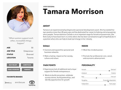
User Personas
Together with Lioness team, we have analyzed the data from their existing blog, current membership applications, and social media demographics. The club had an established target audience, but defining user needs and pain point allowed to make crucial changes and redefine the brand's image.
95%
followers are women between the ages 25-55
80%
followers are successful business owners

75%
followers spend $1,500 or more per month on beauty and fashion related products and services
85%
followers have an annual income of over $120,000
User Experience Mapping
As the monetization of the platform was one of the main goals, it was important to map the user's journey from becoming aware of the club to making a decision to become a member. Making this process as smooth as possible while considering a user's emotional state was a key.

Site Map
I have created a high-level view that allowed us to feel the size and complexity of the platform. We have added and removed certain features to better accommodate the needs of our users.

Sketches
In order to minimize the amount of rework at the hand-off point, it has been decided to engage a development team at this stage, when I started to design the functionality of the platform.
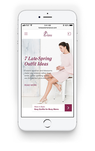
I took a mobile-first approach when designing the website as the users are mainly interacting with the blog from their mobile devices. Designing for a small screen first meant that the platform will be designed around the content and user needs while maintaining the aesthetics on every device.

Mobile and desktop views for homepage and blog

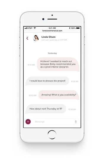
Mobile and desktop views for Lounge page
User Flows
To break down the user's interaction with the platform, I created user flows to separate all the different steps users take when trying to accomplish a task. This helped me decide which steps could be consolidated and where they could be improved.


Final Design
01. BLOG


02. LIONESS NETWORK


More Projects
Job Offer Feature
for Driver App
UX/UI DESIGN
GOAL
Redesign a job offer experience, so drivers can make an informed decision about the job they are accepting.
